Hello everyone,
How are you? Hope you’re doing well!
As always - this is most definitely Not Financial Advice.
Everything I express here is only my opinion and perception of the market, eco systems and communities.
Do not treat any of it as an absolute fact - please do your own due diligence.
Always.
Now, let’s look at one of the most interesting stories from the recent few days -
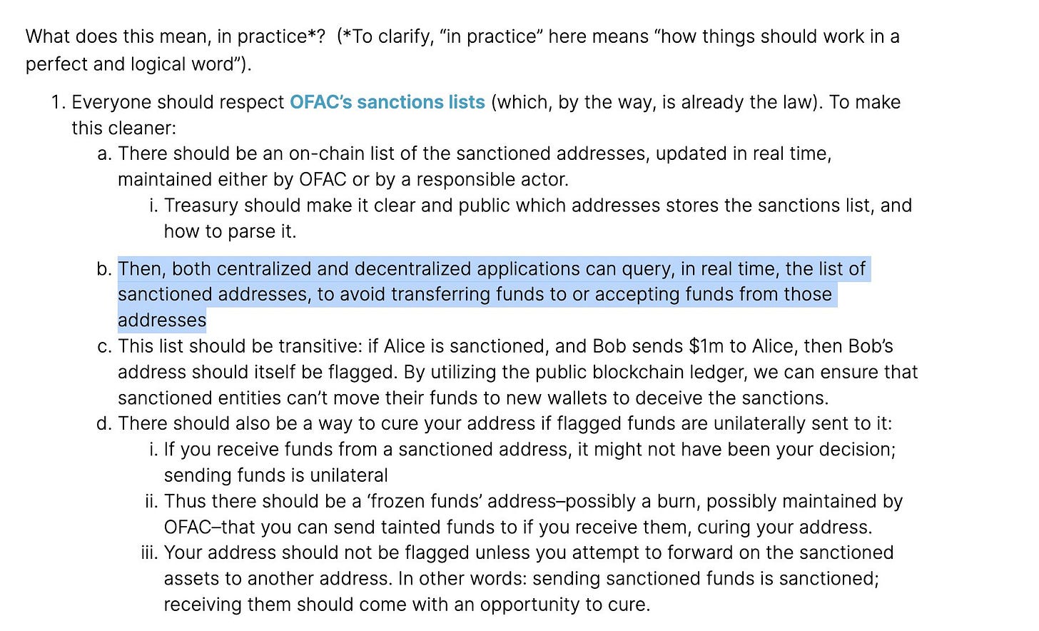
SBF’s thread and article - and the responses it got.
SBF:

Responses mainly have one tone, as you’ll notice.
Makot0x was direct.

Amadeo was harsh.

Exonumia was even harsher:

Let’s move to RSA’s response.


Now let’s look at some of the talks after that response.
SBF replied:


fiskantes also replied to SBF:


And _gabrielShapir0 joined the conversation with his perspective.


Next - DCinvestor.eth was also vocal about this SBF article.


And so were, of course - Autism Capital.
They tweeted this and share this next tweet by rekt:


We’ll get back to both these accounts soon enough.
rekt’s story:


SBF said this.
Autism Capital replied:


RYAN SΞAN ADAMS tweeted this:

This is Erik Voorhees’s response tp SBF:

Looks like we’re gonna have an interesting interview to watch.
For a promo, look at this talk between the two after Erik Voorhees replied to the original SBF tweet:


At this point, señor doggo replied, and this next exchange between him and Nick J | nickjackman. was something I found very interesting:


I tweeted:


Ok, let’s start wrapping up with some more responses from some folks.


Goblin_-Toshi added this:
DCinvestor.eth also tweeted this:


Cryptofungus with this funny one:
scupytrooples.eth tweeted this:


And zefram.eth with his own take on regulation:

And let’s end it with this thread by those who used to be Sam’s biggest fans -
Autism Capital.


Thanks for reading everyone, have a great day!
Hello everyone!
Appreciate your attention! If you want, you can support my work like this:
1. By sending moneys to - :)
defiadvisoor.eth
2. By using my GMX referral link - get 10% off trading on GMX.
Trade responsibly.
3. By purchasing a Ledger hardware wallet using my affiliate link - you pay the same price.
Thanks!
I personally use the Nano S.
I will always let you know when I use affiliate links.
Thanks everyone!
Appreciate every subscription, like, share, RT, comment, reply and above all - your attention!
Be smart investors and educate yourselves as much as you can!


Would it be possible to make better use of UI/graphics to make the newsletter easier to read?
I find many times I give up halfway through reading it because its hard to separate and identify relevant info.
Some kind of headers in bold, list items, horizontal separators.